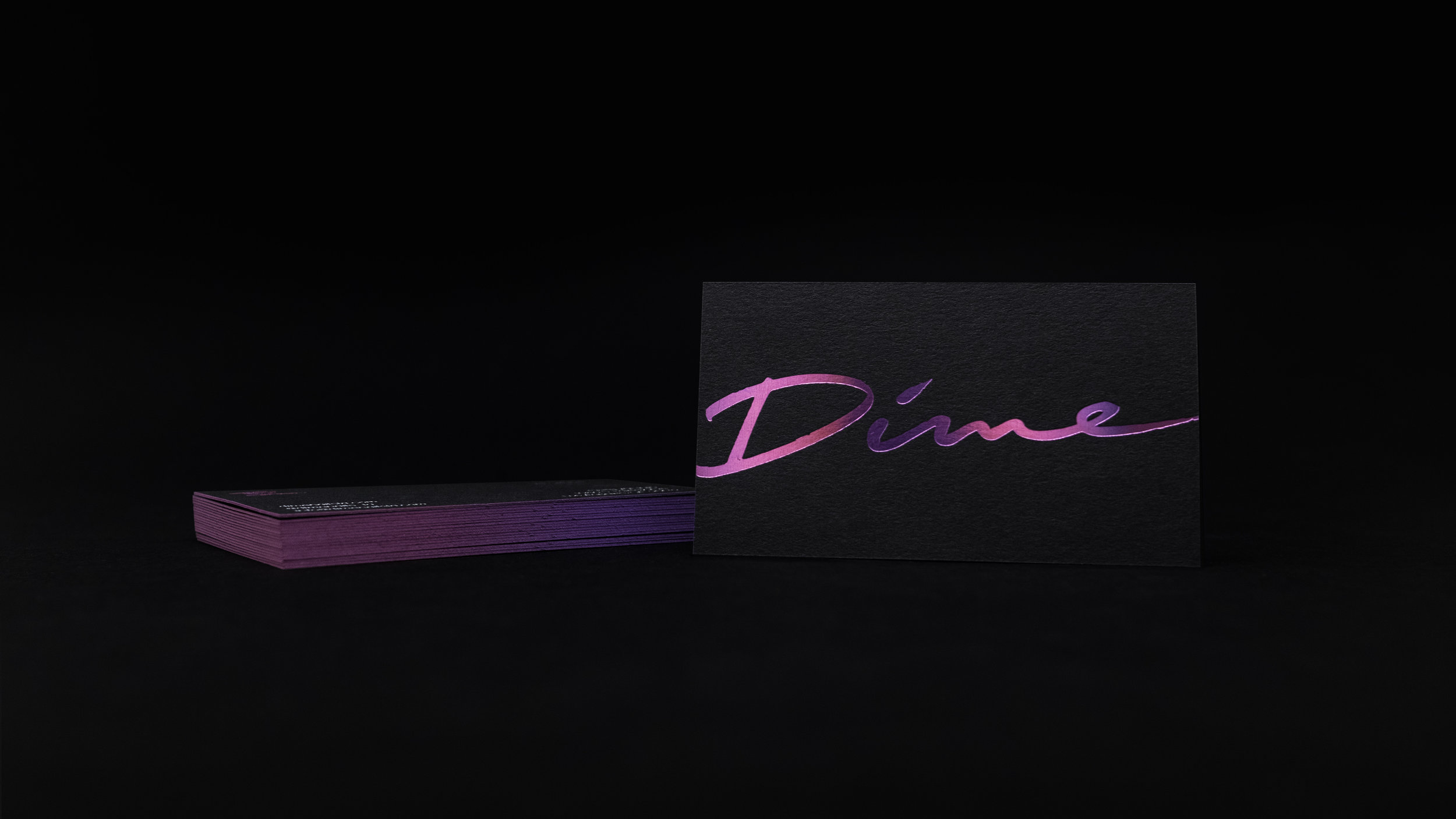
Dime Nails Brand Identity
Dime is a new nail salon that just opened in Los Angeles. Our goal was to create branding that was fierce but fancy, fem and funky, lithe, sexy and hyper-feminine while also exuding a ribald, butch-swagger. Dime is also fabulous, artsy, diva and edgy with 'drug dealer chic' 'no fucks given' vibes, and an influence from the 80's, hip-hop and disco.
-
Logo design, color palette, typefaces, supporting graphics, brand guidelines and business card design.
Business Card Design
Letterpressed business cards printed by Rohner Letterpress. Black and white stocks were letterpressed with holographic foils - magenta on black and purple on white - and finished off with gradient edging.


